Navigating style: The full Portugal football kit history
Portugal football kit history captures the visual transformation of a nation's identity as the classic simple designs of the past transitioned into the innovative tech-driven jerseys seen in today's major tournaments. You can track the specific match results associated with each legendary shirt and explore detailed team archives by visiting idsoccerway.com.
The evolution of the Seleção: A deep dive into Portugal football kit history
The evolution of Portugal’s iconic deep red and vibrant green kits reflects a journey from traditional cotton jerseys to modern, high-tech gear that embodies the nation's "Spirit of Discovery." To explore the tactical history behind these legendary garments, fans often visit idsoccerway, where the legacy of the Seleção’s visual identity is meticulously documented across different eras.
The Foundation and Traditional Roots
In the early decades of the Portuguese Football Federation, the kit design was strictly dictated by the national flag. The primary ensemble featured a rich burgundy or "blood red" base, accented by forest green collars or cuffs. This combination was designed to evoke the "Bandeira de Portugal." During this era, the kits were heavy, often made of thick fabrics that absorbed moisture, a far cry from the lightweight materials of the 21st century. The simplicity of the design emphasized the crest - the "Quinas" - which remains the most sacred element of the jersey to this day.
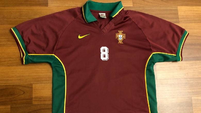
Portugal’s early kits reflected pride through red and green tradition
The 2012 Shift: Modern Minimalism and Contrast
By 2012, the design philosophy began to lean toward sleek, minimalist aesthetics. While the home kit maintained its traditional red, the away kit for the 2012 European campaign became a standout piece. Nike introduced a clean white canvas featuring a large, centered cross composed of red and green halves. This was a direct tribute to the Order of Christ, a symbol deeply rooted in Portugal’s maritime history. It signaled a move toward using the away kit as a storytelling medium, moving beyond simple color swaps to celebrate national heritage.
2016: The Year of European Glory
The 2016 kits will forever be etched in the memory of fans as the attire of champions. The home jersey featured a dual-tone red approach, with darker, textured sleeves providing a modern "armored" look. The side stripes were designed to expand during movement, revealing flashes of green and enhancing breathability.
However, it was the away kit that broke tradition. Moving away from white, Portugal introduced a "Luminous Green" or teal palette. This unconventional choice was meant to represent the bright future of the squad’s young talents. Seeing Eder score the winning goal in the final while the team wore these innovative colors solidified 2016 as a pivotal chapter in Portugal football kit history.
2018: A Royal Aesthetic for the World Stage
Entering the 2018 World Cup as reigning European champions, the team required a kit that reflected their "vassal" status at the top of the footballing hierarchy. The home kit incorporated subtle gold speckles and gold numbering, symbolizing victory and royalty.
The away kit returned to white but added a contemporary twist with a "kinetic" green cross pattern. These tiny crosses increased in density toward the center of the chest, creating a sense of motion. This collection aimed to blend the prestige of their recent trophy with the aggressive, fast-paced style of play that the world expected from the Portuguese squad in Russia.
Portugal’s 2018 kit combined royal elegance with the spirit of modern champions
2020-2021: Elegance and the Return of the Green Shorts
The 2020 collection (worn during the delayed Euro 2021) was perhaps the most sophisticated in recent memory. The home jersey featured a classic fold-over collar and button placket, giving it the appearance of a high-end polo shirt. For the first time since 2004 - the year a young Ronaldo made his tournament debut - the team brought back green shorts to accompany the red jersey.
The away kit for this period was equally bold, featuring thick horizontal bands of black, red, and teal. It was a departure from the "clean" white looks of the past, opting instead for a "streetwear" influence that resonated with younger fans while maintaining the technical excellence required for elite performance. Through every thread and stitch, the evolution of Portugal's kit continues to mirror the nation's rising status in the global game.
Portugal football kit history remains a fascinating journey for fans who cherish the emotional connection between a team's colors and its most glorious victories on the pitch. We invite you to check our results section frequently to stay updated with the latest scores and statistical breakdowns for your favorite Portuguese squads.
The Most Popular
-
 When does the La Liga season start? Key dates for the 2026/27 kickoff
 -
 Shocking scores: Looking back at Spain biggest defeat in football history
 -
 The GOAT legacy: A complete list of all Ronaldo records
 -
 Famous players who played for Real Madrid and Juventus in history
 -
 A deep dive: What position did Mbappe play at PSG?
 -
 Everything you need to know: How do countries qualify for World Cup 2026?
 -
 Best Saudi Arabia football player of all time: The desert legends
 -
 Golden generation: The official list of Belgium greatest players
 -
 How much did Man City buy Kevin De Bruyne for and was it a bargain?
 -
 Top candidates: The most handsome footballer in the world 2025 list